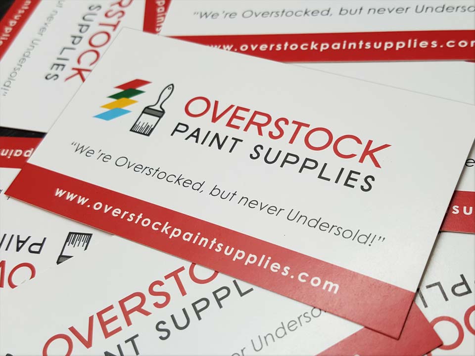
Overstock Paint Supplies
February 22, 2018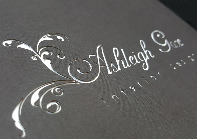
Ashleigh Gore Interior Design
April 27, 2018Portfolio
Client: Marks Morris Construction
Industry: Construction / General Contractor
Description: Logo Design
Comments: The client wanted to re-brand the company to reflect a more established professional image. The logo uses two “M”s to create the shape of a building facade which rests on a firm foundation, formed by the Marks Morris name. Blue and grey are colors that instill a feeling of trust and also communicate an established, masculine feel. Font has a traditional feel with a slightly modern element, representing both the history and future of the company.
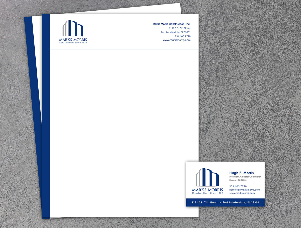
Description: Business Card, and Letterhead Design
Comments: Clean, updated branding and design gave the Marks Morris business cards and letterhead a professional look.
Comments: Clean, updated branding and design gave the Marks Morris business cards and letterhead a professional look.
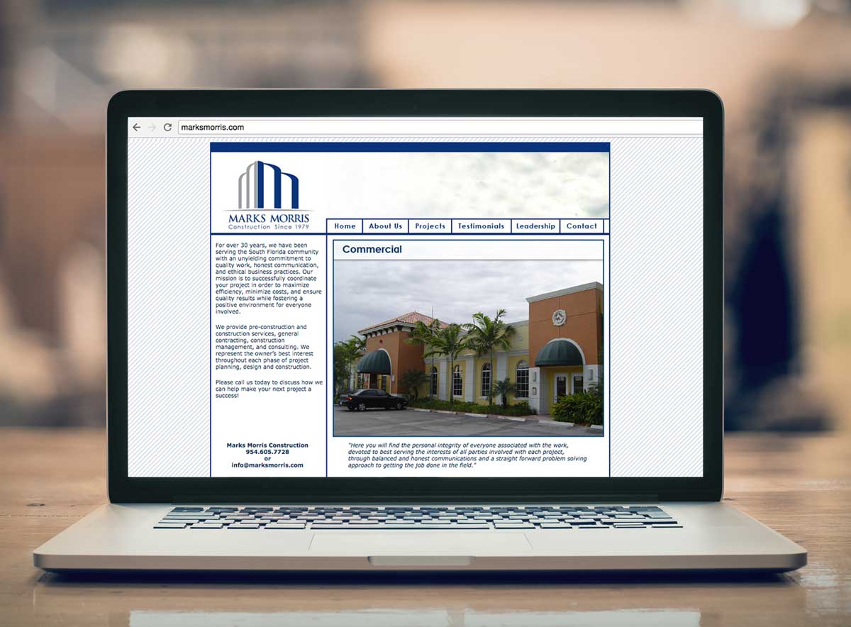
Description: Website Design
Comments: Client needed an updated website that would allow them to show their broad portfolio or work completed over the past 30+ years. Site content was developed and organized to create easy navigation and an engaging user experience. Slideshows display different images of each project within the portfolio section. Site also includes testimonials, construction awards, and general company information.
Comments: Client needed an updated website that would allow them to show their broad portfolio or work completed over the past 30+ years. Site content was developed and organized to create easy navigation and an engaging user experience. Slideshows display different images of each project within the portfolio section. Site also includes testimonials, construction awards, and general company information.